
US Air Force
2001 - Siegel and Gale
The previous logo, the ‘Hap Arnold Wings’' - designed in 1947, had no visual connection to other Air Force insignia. The new mark cradles existing symbols to demonstrate that everyone is part of a larger force.

Adidas innovation
2008 - Adidas
Aligning technologies and clarifying consumer benefits across categories to leverage Adidas' investment in research and development.
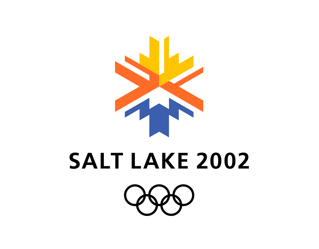
Salt Lake City Olympics
1998 - Landor
Bold applications of the Salt Lake City Olympic Winter Games logo and visual identity maximized impact both on television and in person.

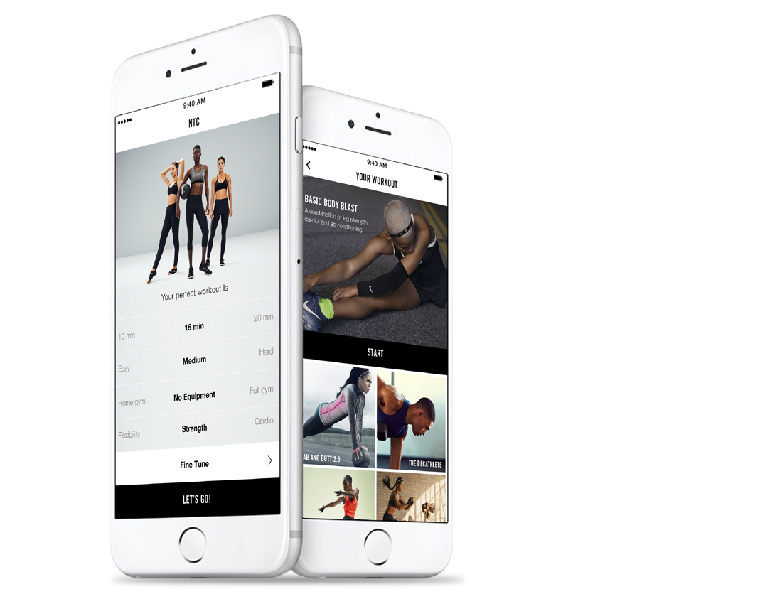
Nike+ Link
2017 - Nike
'Know me to serve me' is the defining principle of Nike’s retail strategy, and the Nike+ Link app helped salespeople personally serve customers by surfacing relevant information about their preferences and purchases.
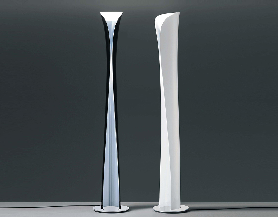
Artemide Cadmo
2005 - Karim Rashid
The Cadmo lamp was designed to be manufactured by bending a single sheet of aluminum to create a shade.
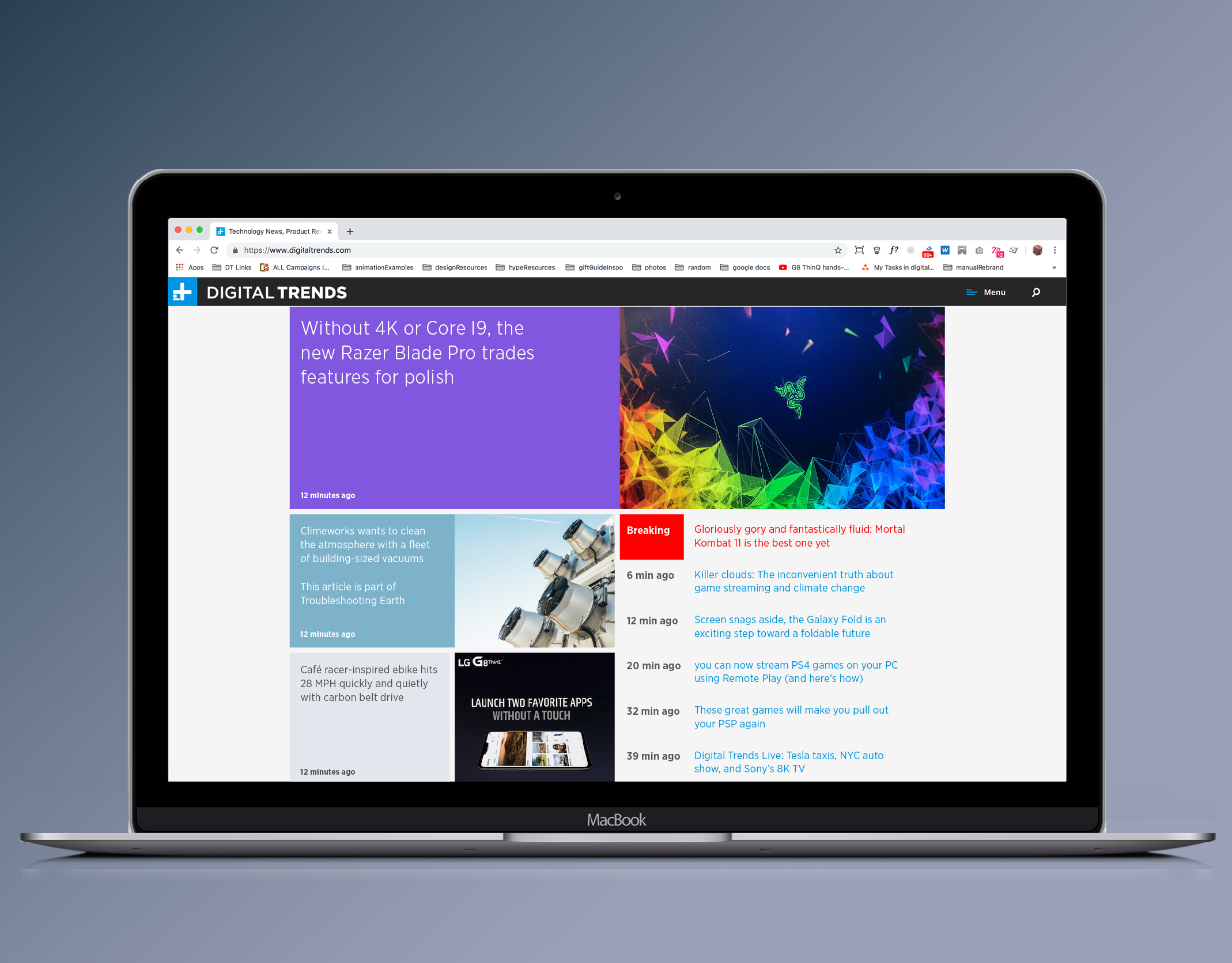
Digital Trends
2019
A year long project to design and build a new site for Digital Trends, a publisher of technology news and reviews. Based on a modular system that could be easily reconfigured, it was designed for improved SEO performance and increased audience engagement.
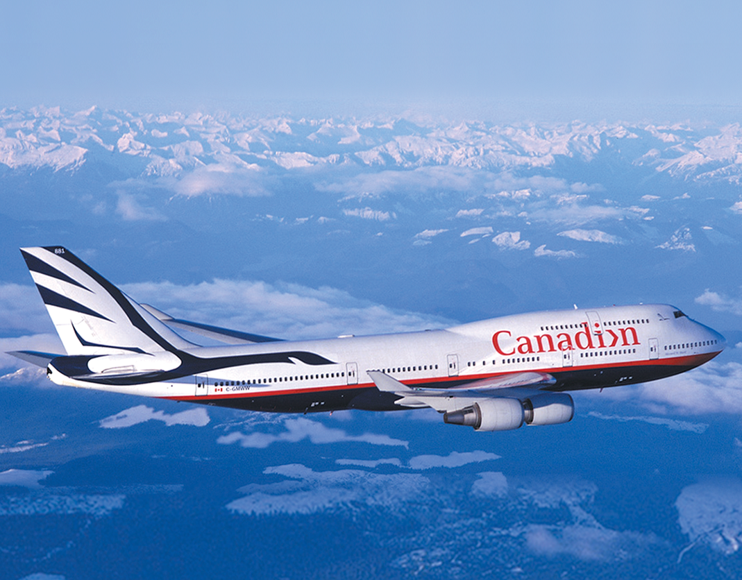
Canadian Airlines
1998 - Landor
The teamwork required for Canadian geese to migrate south for the winter was used as a metaphor for the task of managing a modern airline.
Logos
1996 - 2018
A collection of logos and wordmarks.
Nike digital concepts
2017 - Nike
App concepts created to demonstrate opportunities to leadership and inspire product teams to create more intuitive interfaces.
Products
2005 - Karim Rashid
A collection of projects from my time working with Karim Rashid.
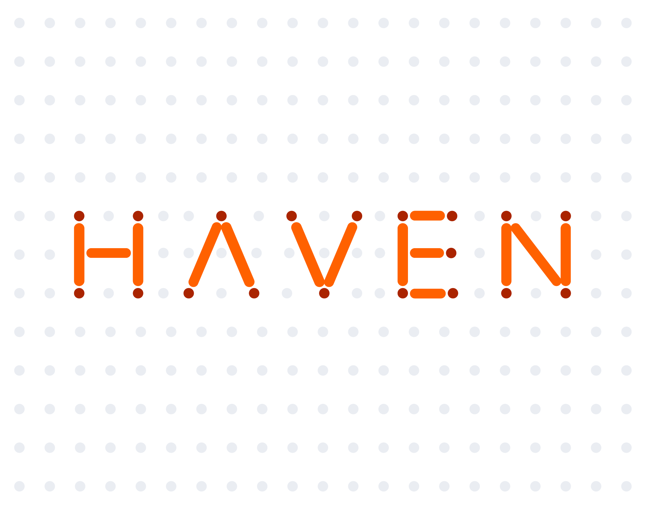
Haven
2018
Haven was a not-for-profit, healthcare-focused entity created through a joint venture by Amazon, Berkshire Hathaway and JPMorgan Chase. The goal was to create an identity that was approachable and simple, and unique in the industry.

Microsoft Cloud
2020 - Microsoft
Replacing in-person gatherings with virtual events that allowed unlimited attendees increased the focus on promoting these conferences through digital channels.

Wordplay
2012 - Springy Games
The game Wordplay combines aspects of Scrabble and Tetris, tiles are placed on the board and points are scored as they descend to form words. A clean, simple interface minimizes distractions.
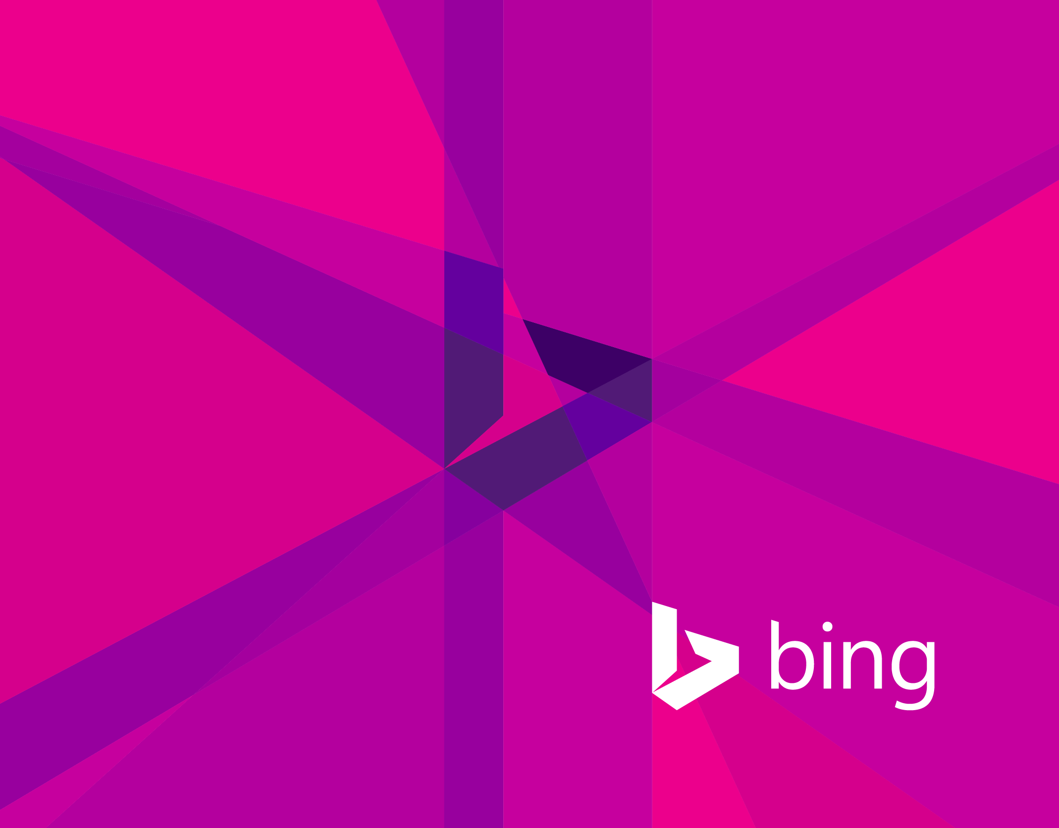
Bing
2013- Microsoft
Using the angles of the Bing logo, we created an element that could be used alone or in conjunction with photography. The color palette was designed to be harmonious with the colors used in other Microsoft products.
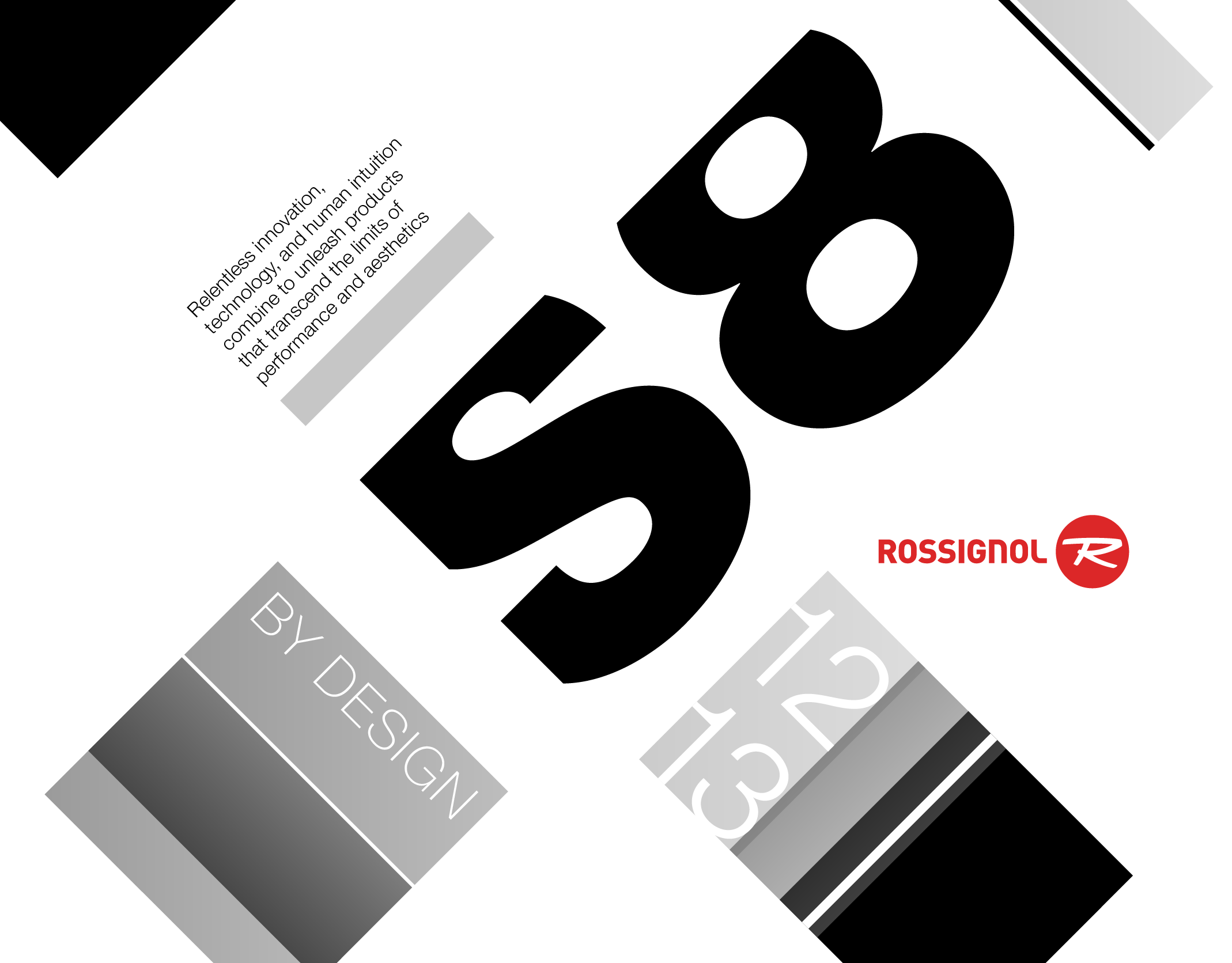
Rossignol
2008 - JDK
Utilizing a 45 degree angle balanced dynamism and precision, and thebpowerful use of black and white provided a canvas for their brightly colored products.
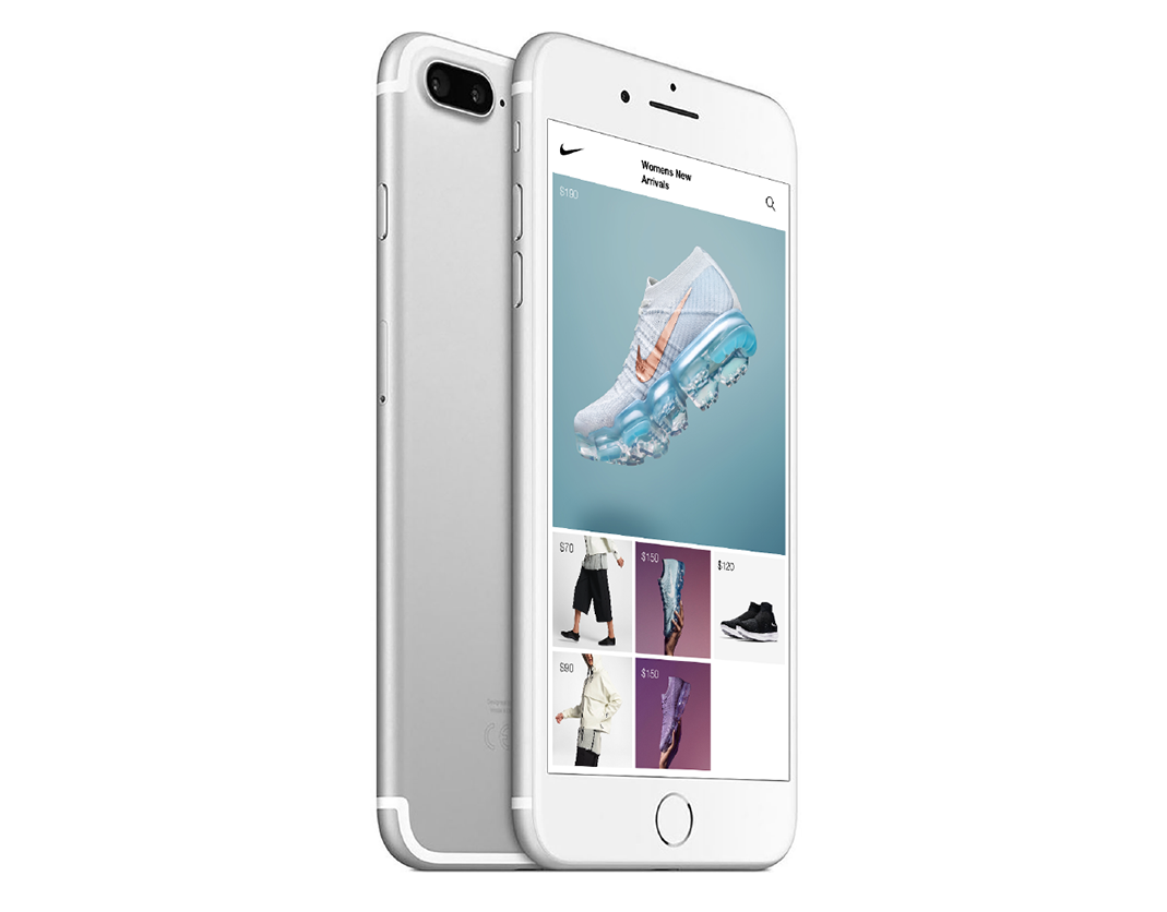
Nike app
2017 - Nike
Utilizing the 'edit to amplify' principle, this Nike app prototype reduces the information displayed on the home page to a product image and price, the two most important pieces of information for most customers.
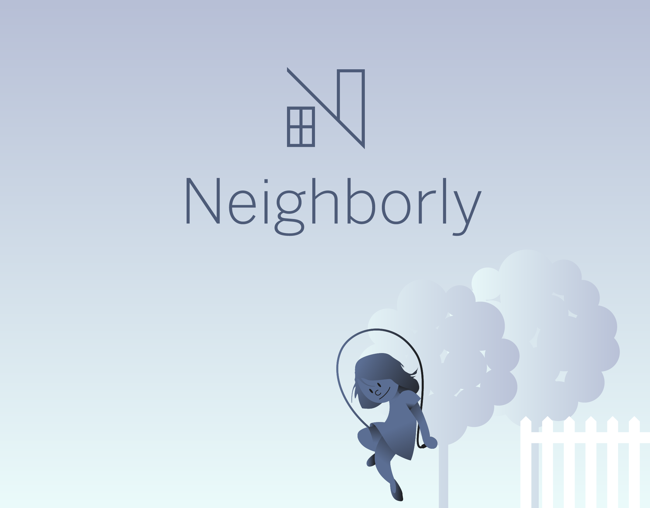
Neighborly
Neighborly was an app that provided local services, and the interface was designed to minimize the number of taps to confirm a booking while providing a large number of package options.
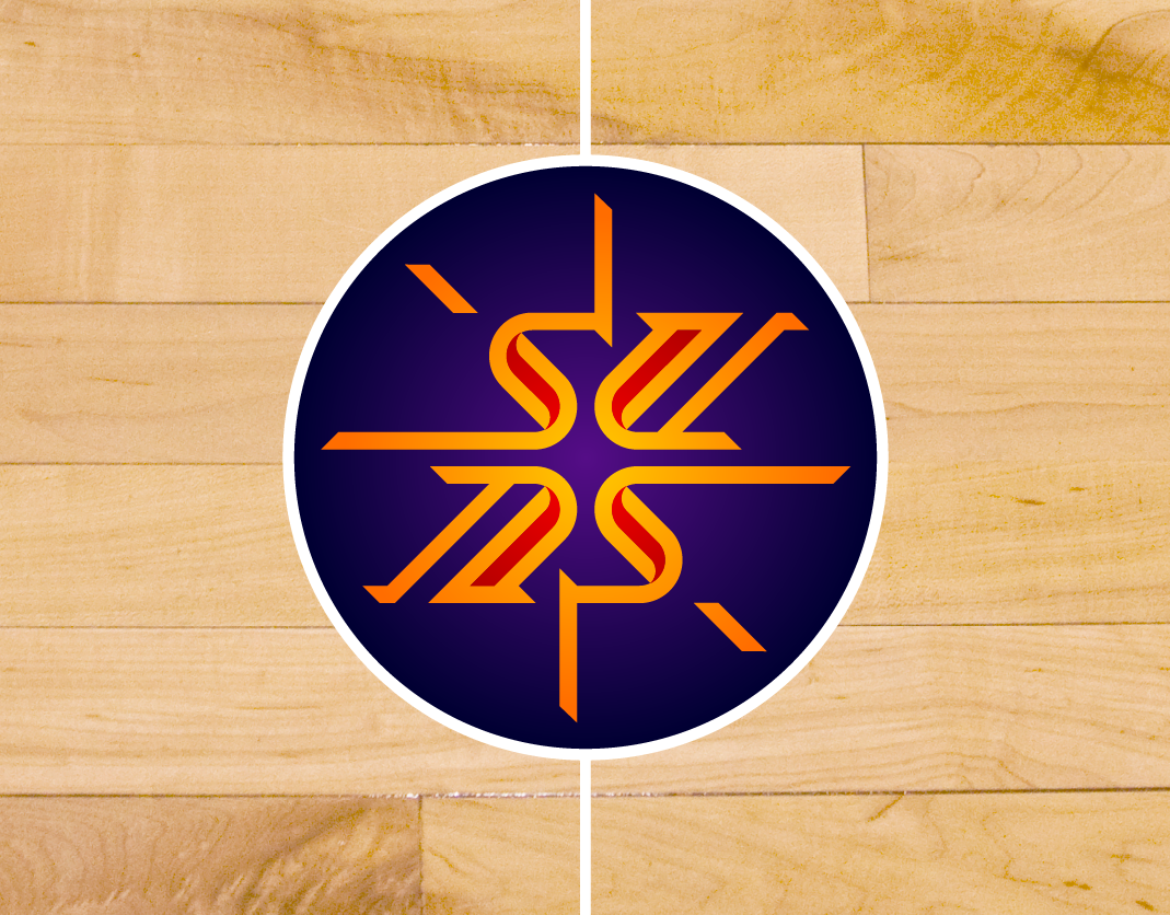
NBA logos
2008 - Adidas
Part of Adidas' NBA partnership included proposals to update the Phoenix Suns and the Philadelphia 76ers franchise logos.
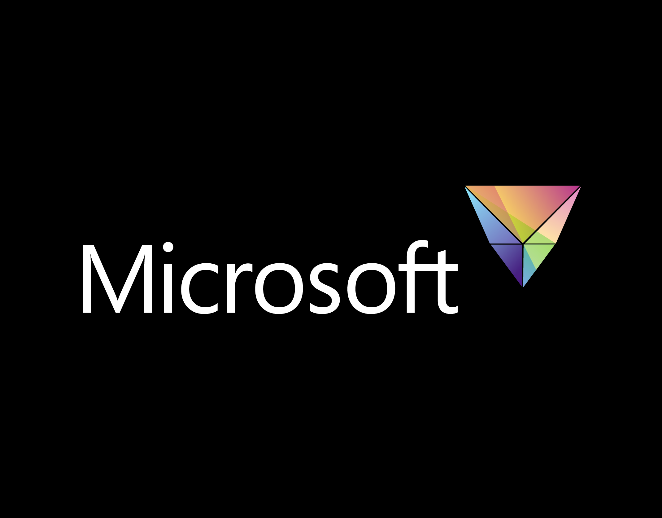
Microsoft Logo
2006 - Microsoft
A prism represents Microsoft's broad range of products and services while conveying a feeling of light and openness.
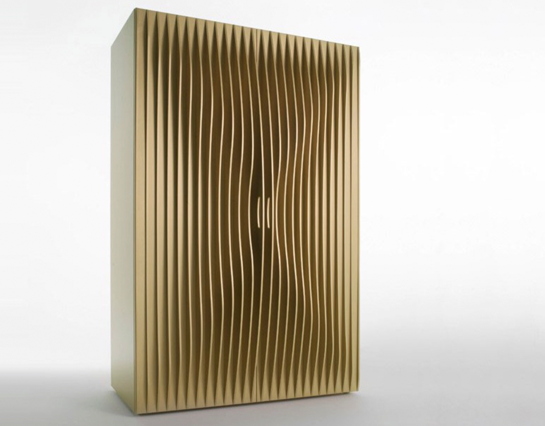
Horm Blend
2005 - Karim Rashid
The distinctive wave shape of the vertical panels on this wardrobe emphasize the door handles. The same panels were also used to create a set of drawers.
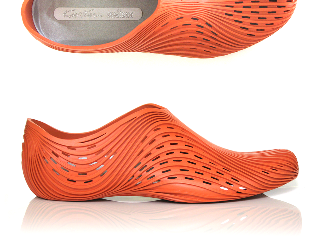
Footwear
2005 - 2011
A collection of footwear concepts for Karim Rashid, Merrell, and Adidas.

Emit
2012
With a partner, I established Emit Creative, a line of women’s clothing created by combining performance fabrics with simple, modern silhouettes and laser cut patterns.

Typefaces
2008 - 2012
Personal explorations that utilize Adobe Illustrator to create rich and expressive typefaces.
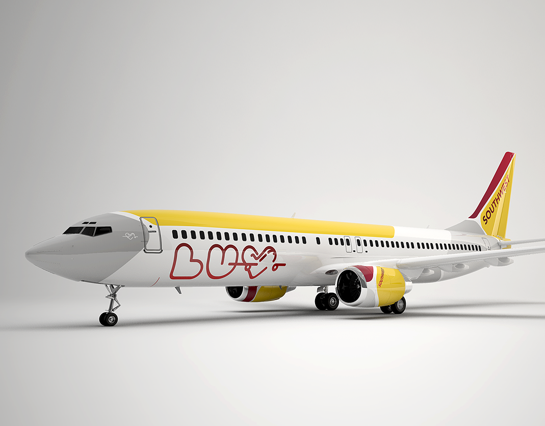
Southwest Airlines
2011 - Siegel and Gale
Southwest wanted to modernize their visual identity and livery, but ensure that it still felt playful, and was distinctly different from their competitors.
Adidas color
2008 - Adidas
A cross category approach leveraged the full breadth of adidas’ influential athletes to shape color trends, increasing brand recognition in crowded retail environments.
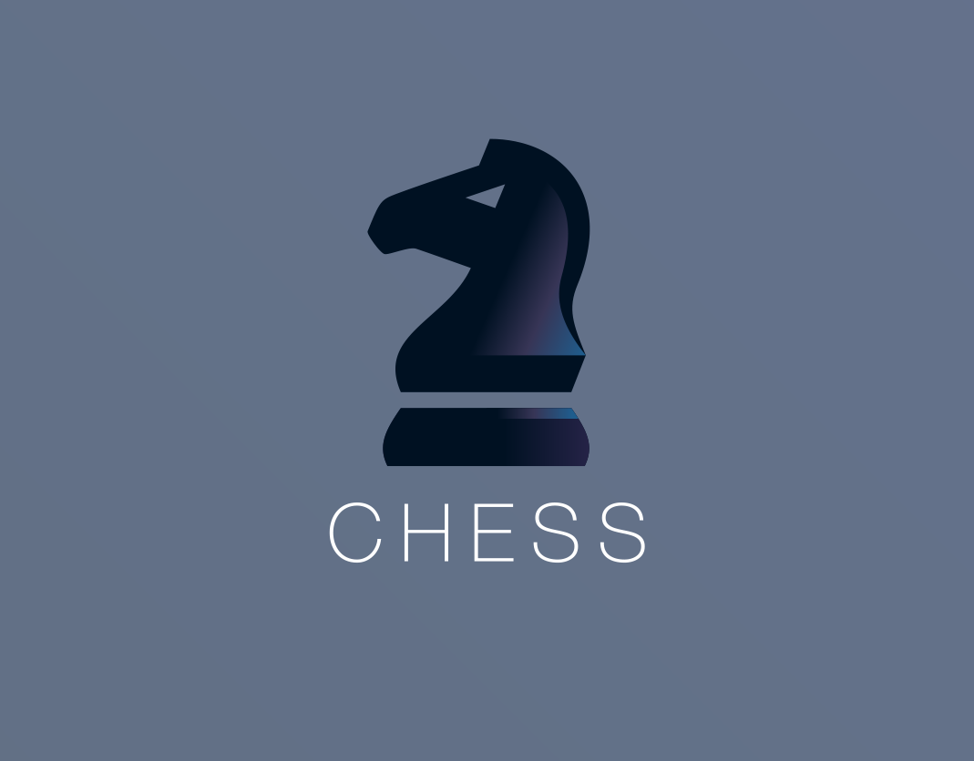
Pure Chess
2014
The pieces for this chess app were designed after studying both physical sets and traditional diagrams, and the interface was designed to minimize distraction.
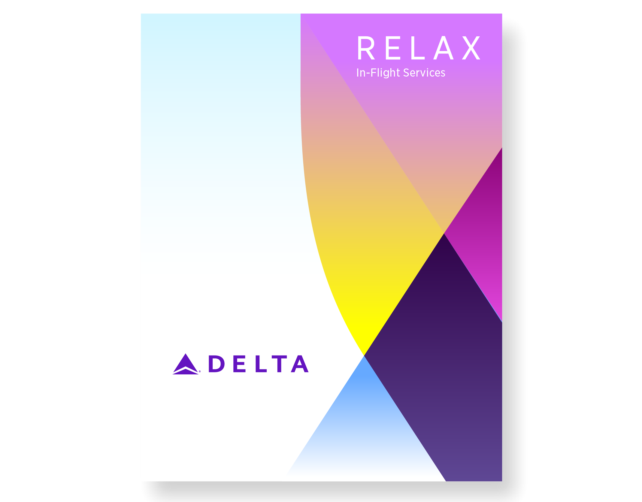
Delta Airlines
2018 - Salt Branding
A proposal to update Delta Airlines' visual identity, adding youthful and vibrant colors without diminishing Delta's premium feel.
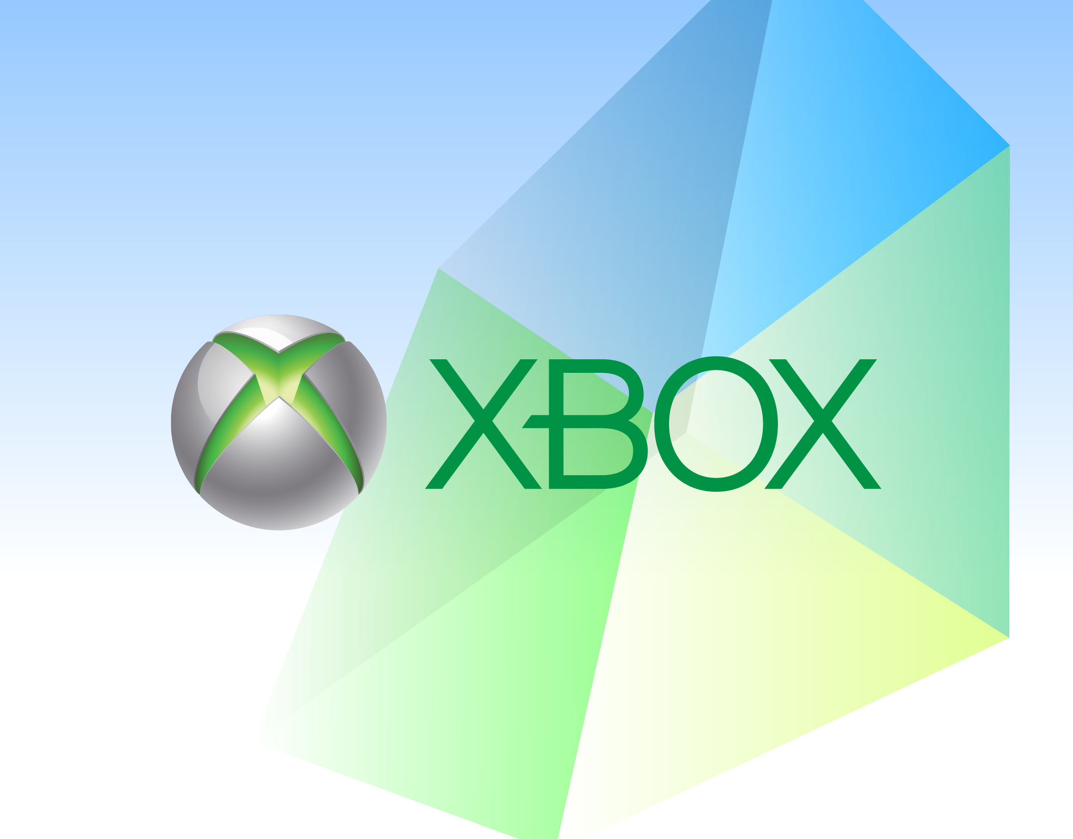
XBox
2012 - JDK
XBox One exploration began before the hardware and name were defined, providing the opportunity to explore color and atmosphere without being constrained by the physical form of the product.
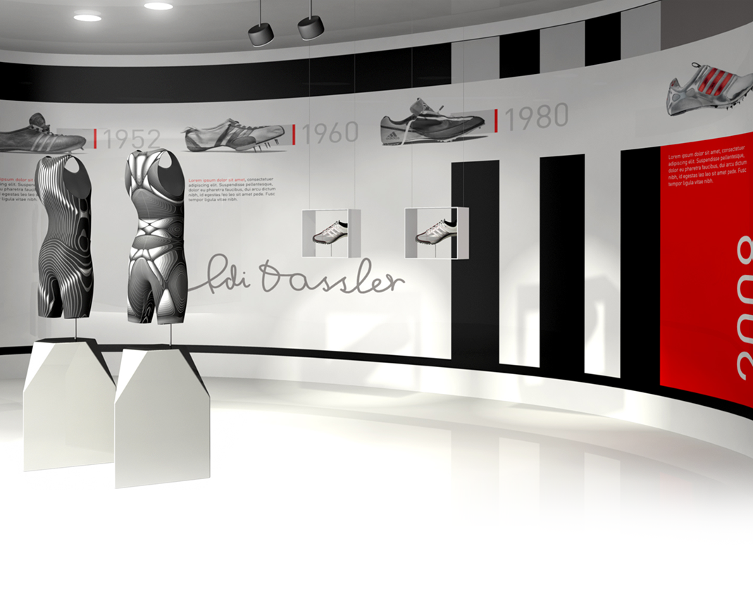
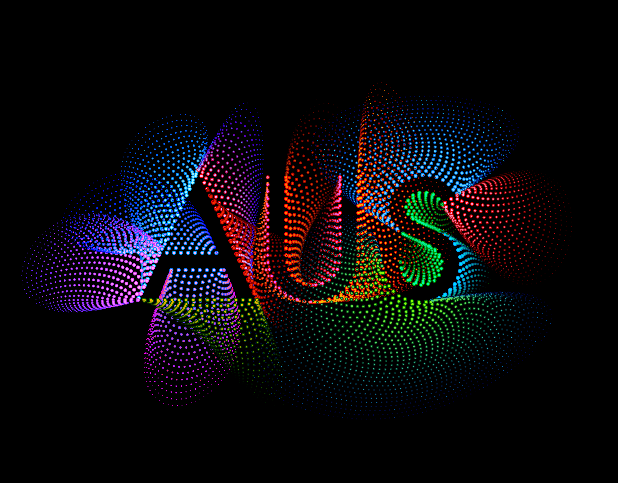
Adi Dassler concept
2009 - Adidas
The Adi Dassler concept was created to provide a platform for the company’s most advanced technologies, strengthening Adidas’ reputation as a premium and innovative brand.

Angular Typeface
2010
Typeface 2 is a geometric typeface that uses closely spaced lines to appear translucent.