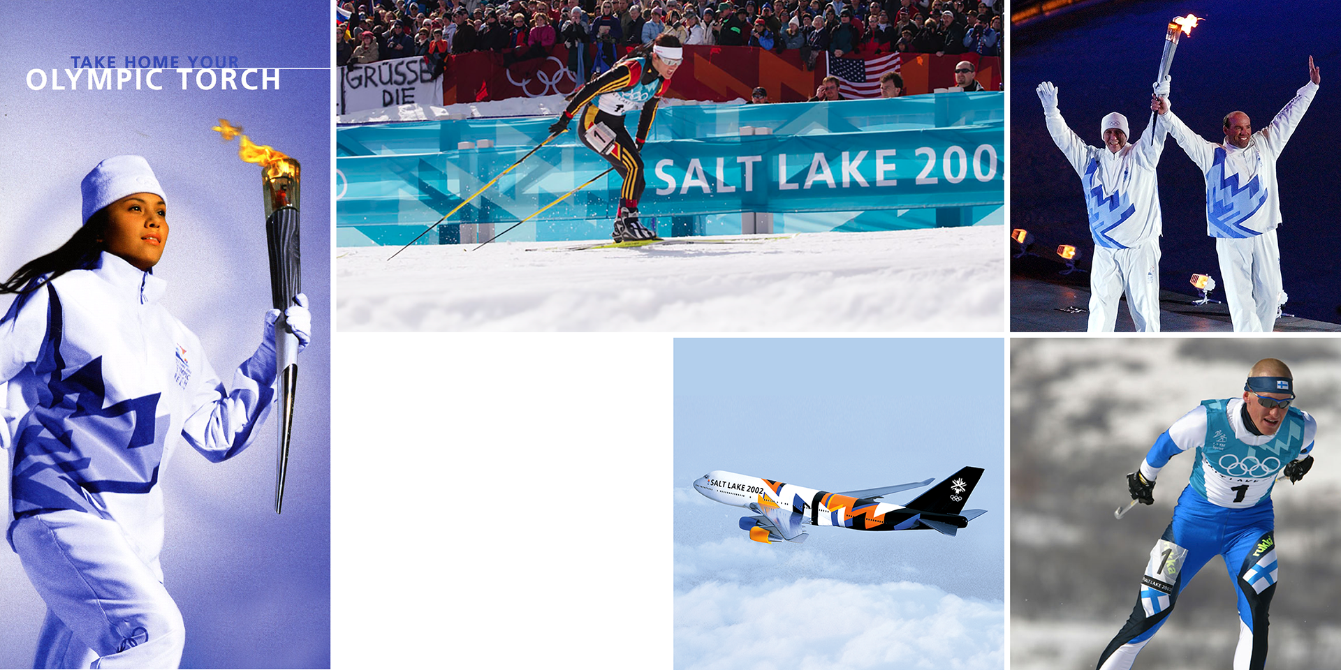

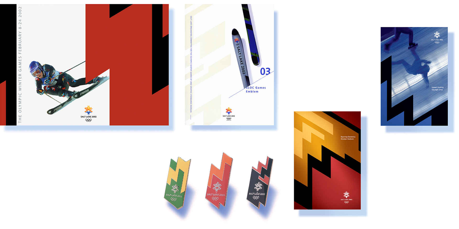
Historically the graphic identity for the Olympic games has focused on the logo, with the secondary graphics playing a minor role. Studying previous Olympic identities we realized that focusing on the logo alone made it very difficult to own the space at events in the winter games as they are often staged in large areas. For the Salt Lake City Olympic Winter Games we created the visual system and the logo simultaneously, devoting our attention to the way the secondary graphics could be more effective when televised.
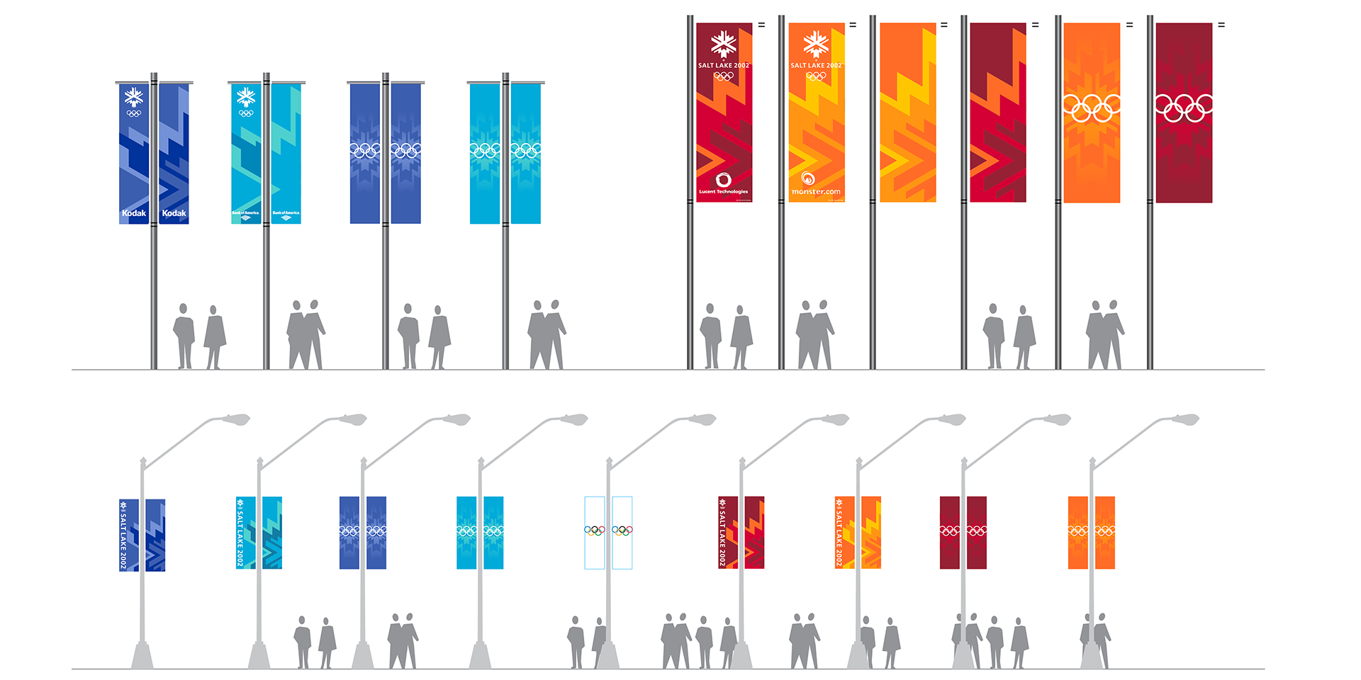
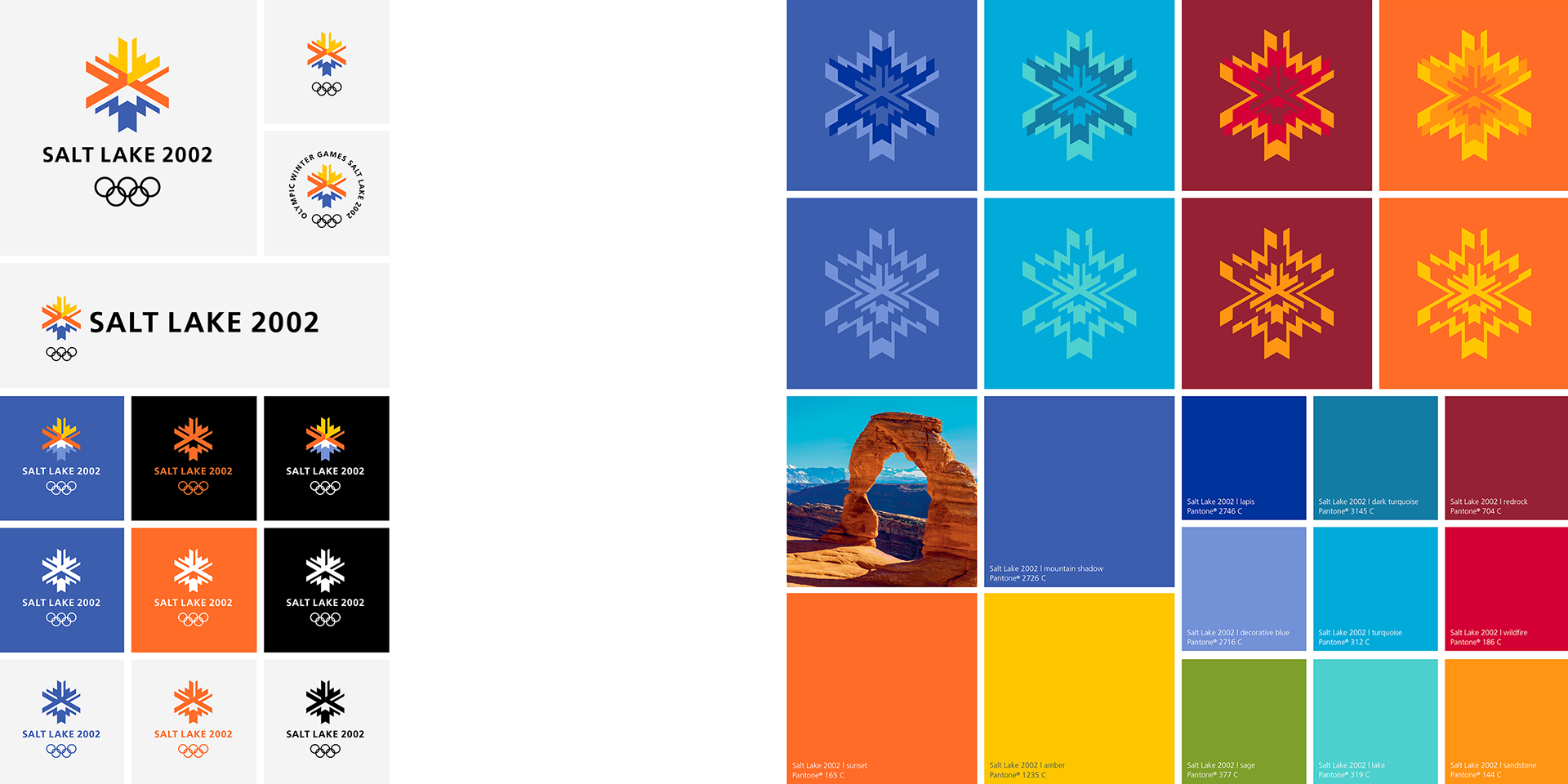

We created a distinctive pattern that could be scaled and cropped tightly and still be instantly recognizable, and the color palette was created for maximum impact on television. The result was a flexible system ideally suited for the broad range of applications. This approach influenced the graphic identities of subsequent games, with a far greater emphasis on the broader identity elements.