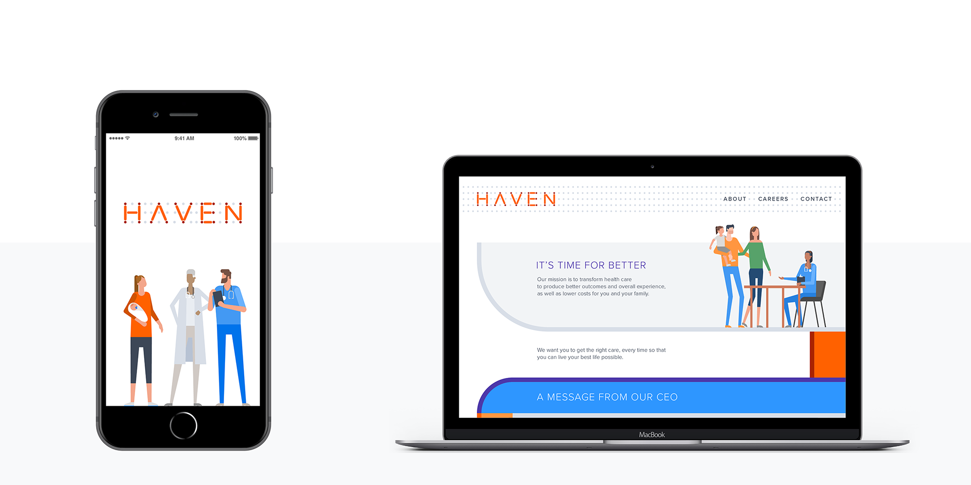
Haven piloted new ways to access primary care, make insurance benefits simpler to understand, and ensure that prescription drugs were more affordable for its members. The logotype visually represented the connection between caregivers and patients.
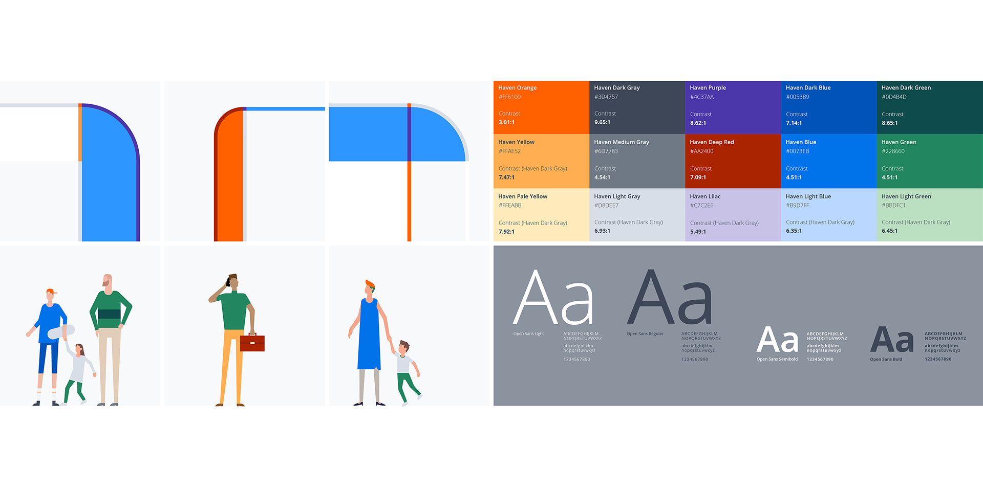
To be unique in the industry, the color palette was built on a vibrant orange rather than the traditional greens and blues, and illustrations were used to represent the diverse nature of Haven's members.
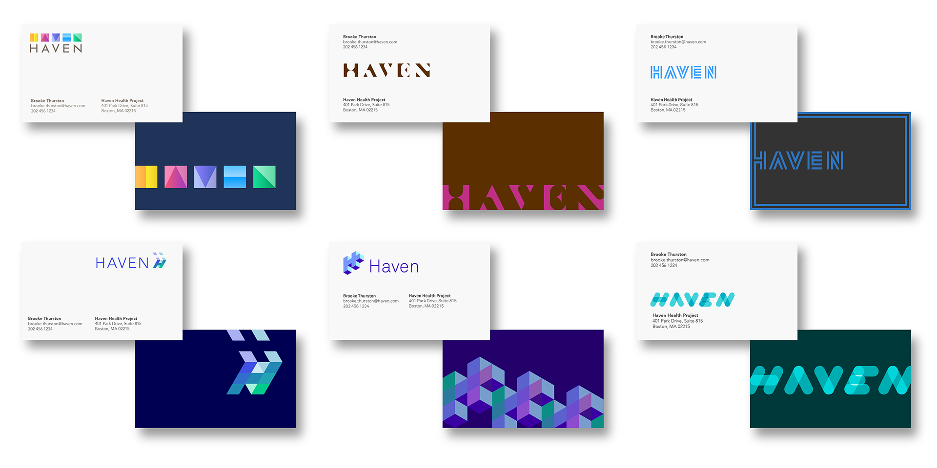
The visual identity was being developed in parallel with the positioning and mission statements, so a broad range of solutions were presented in the first round.