The existing Digital Trends site was inflexible, cumbersome to maintain, and slow to load, diminishing audience engagement and SEO performance. The timeliness of posts was critical to audience engagement, and working with editorial and content, we reduced page creation time so they could quickly respond to audience demand. We worked with SEO to optimize navigation, surfacing topical events in the navigation bar, and reducing click depth by increasing density on most pages. Working with the development team, we reduced page load times to increase engagement and SEO performance.
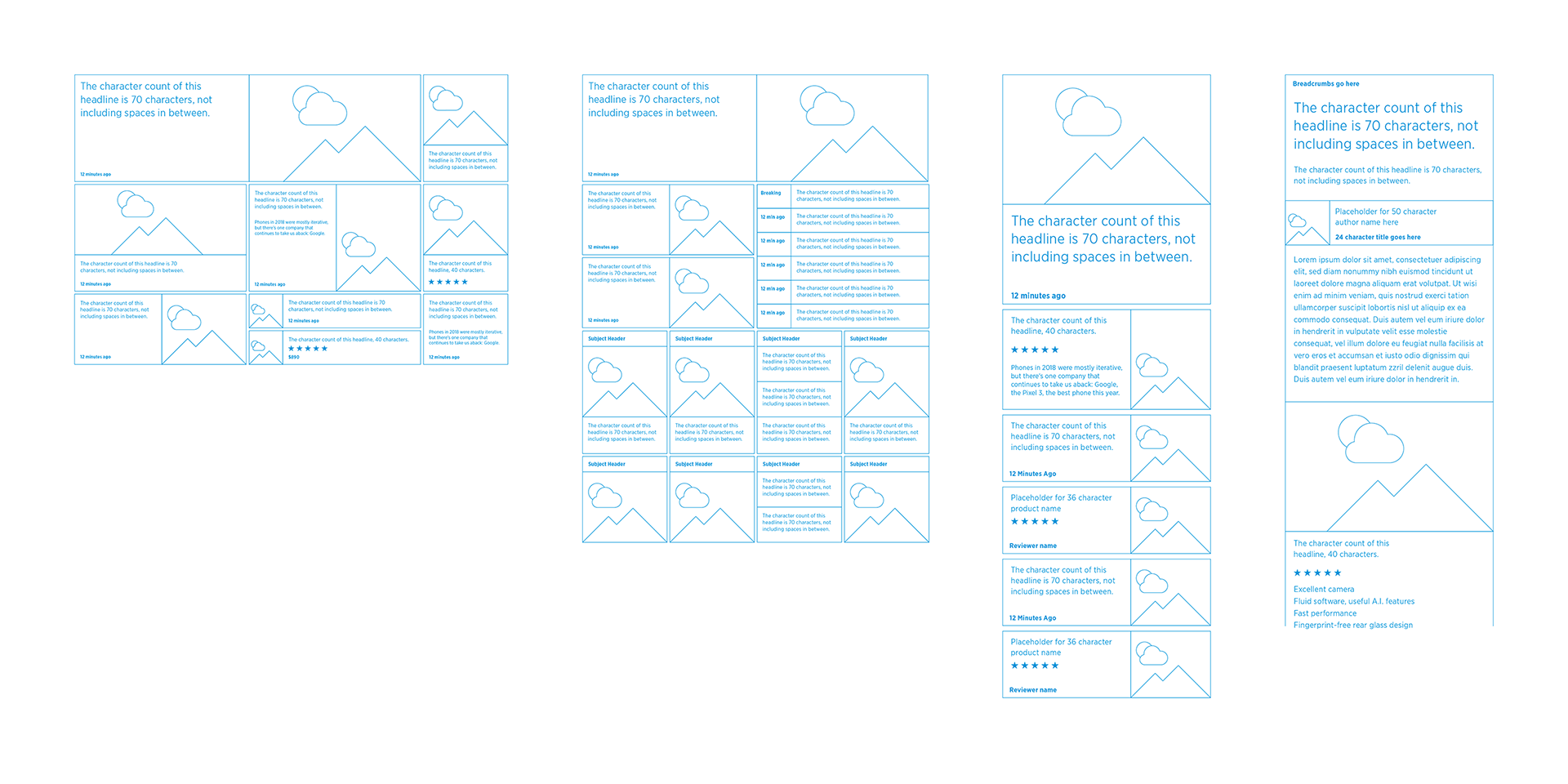
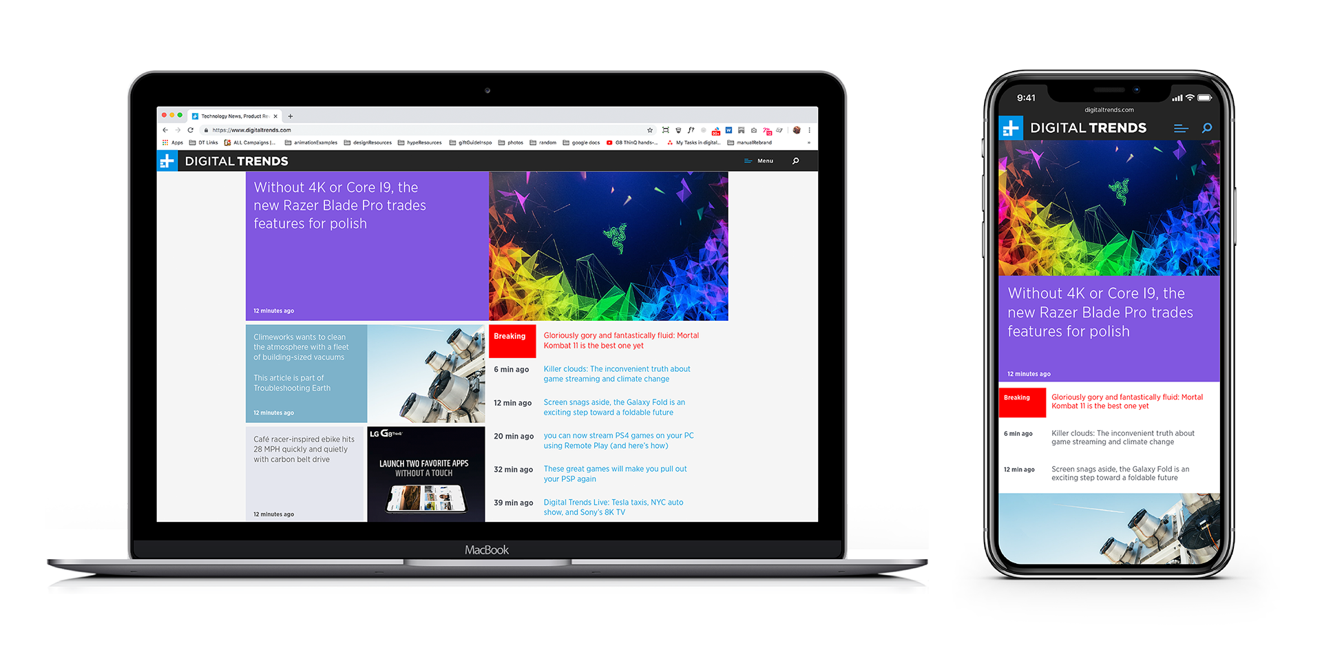
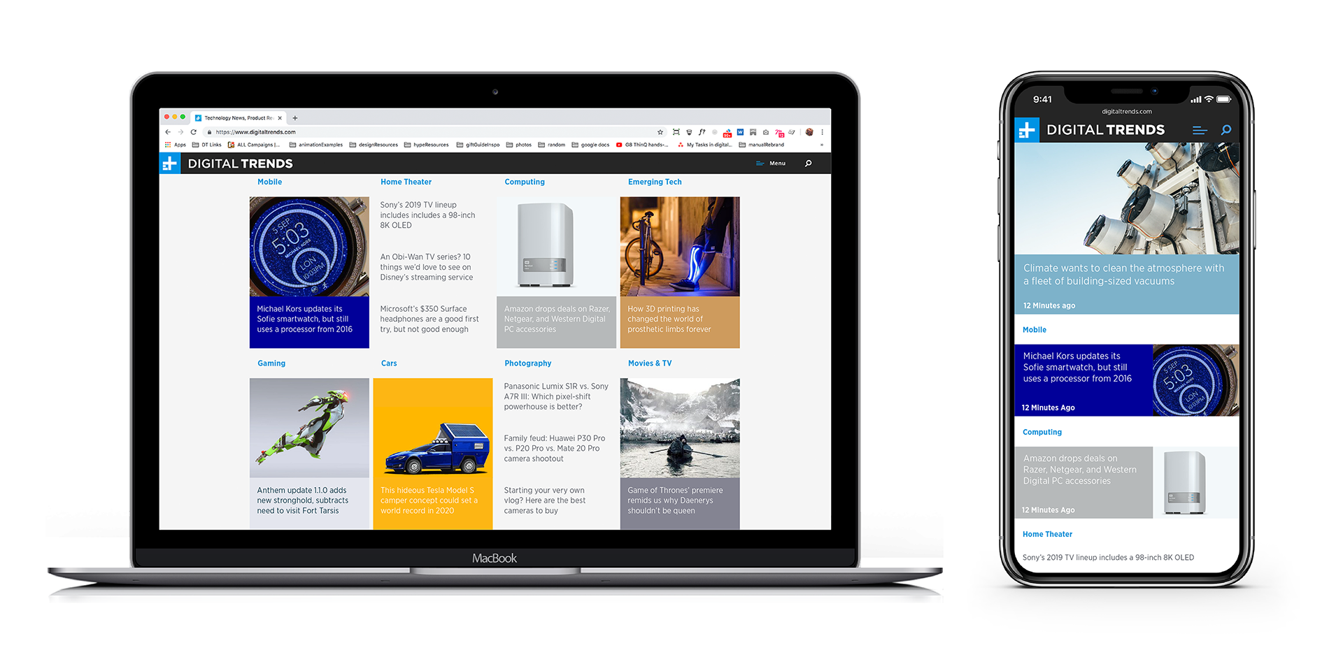
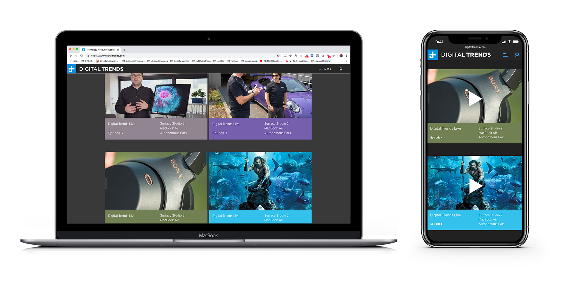
We found that multiple headline lengths and image aspect ratios dramatically slowed page creation time, so we created a The foundation flexible modular system with standardized headline lengths and a reduced the number of aspect ratios. This allowed the content and editorial team to easily reconfigure pages to ensure that the most timely and popular stories were surfaced.
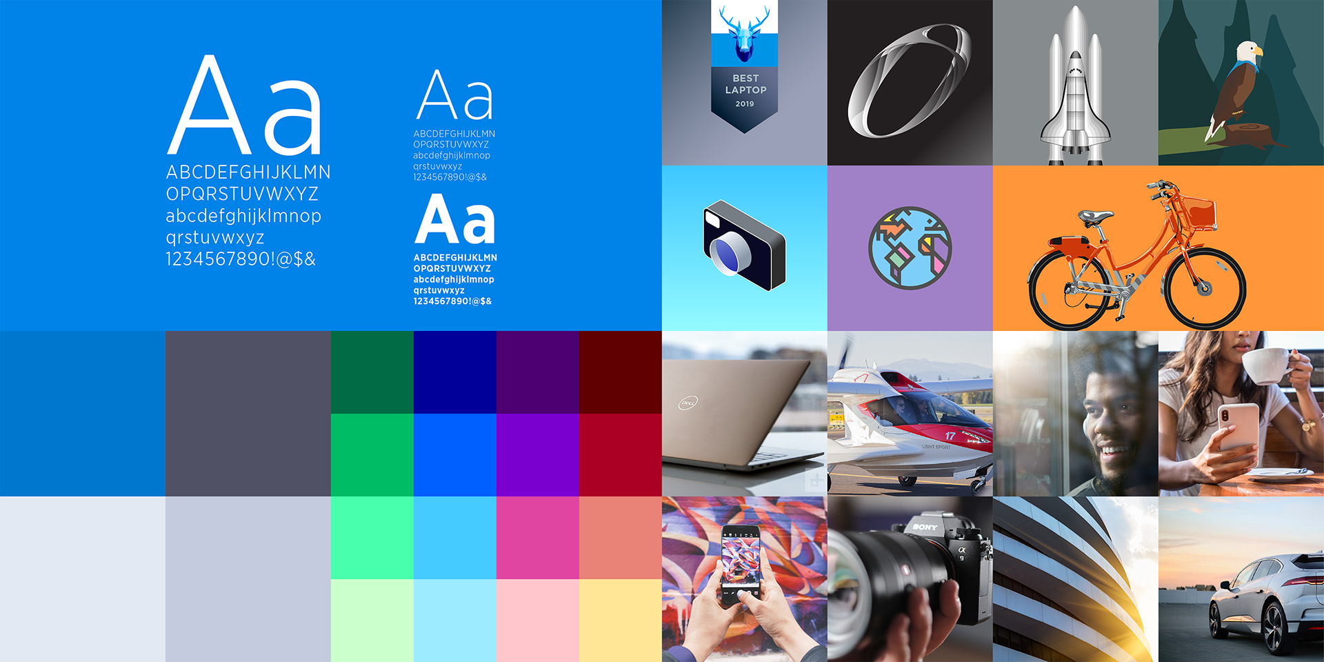
To bring the modular system to life, we created a visual identity that utilized bright and welcoming color, human and optimistic imagery, and vibrant graphics.
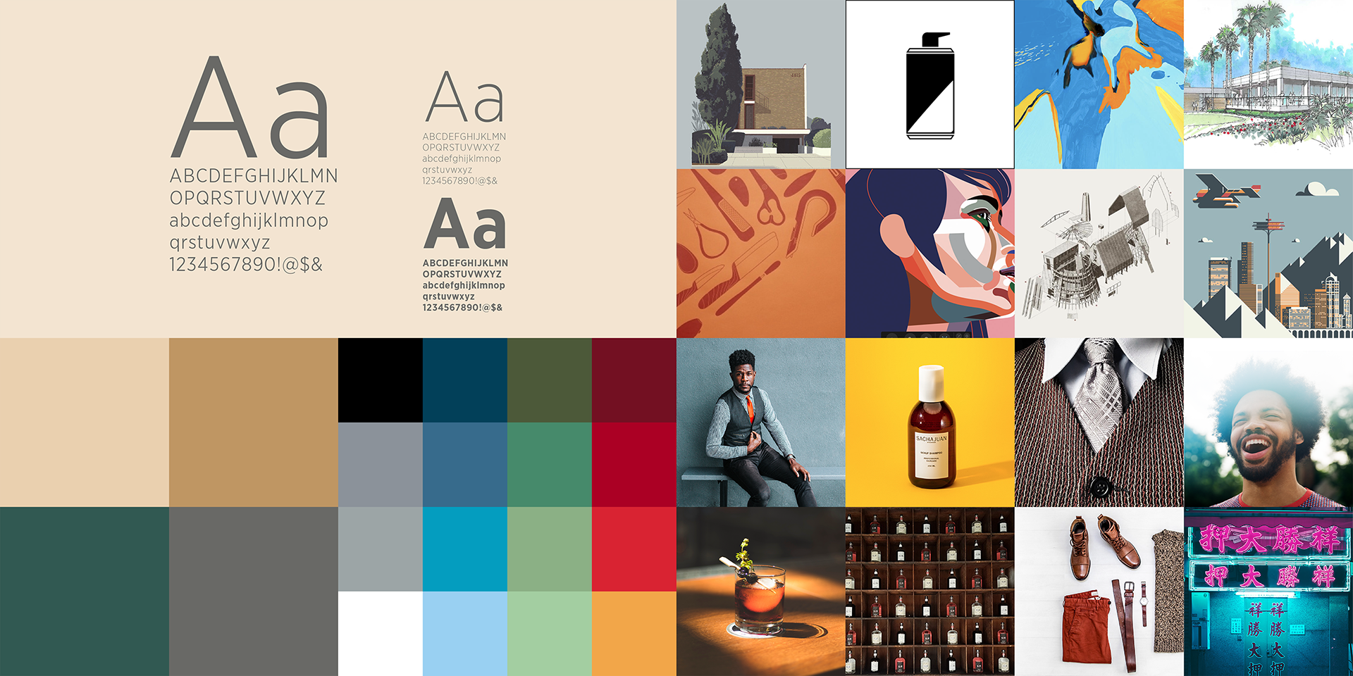
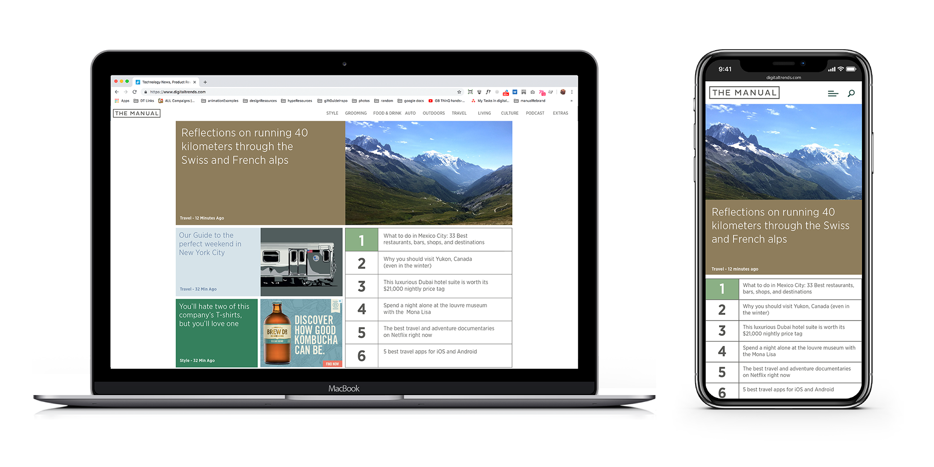
Adjusting the color palette, and photography and illustration styles, allowed us to create a distinctly different look and feel for The Manual, another site in the Digital Trends portfolio while utilizing the same modular system. Digital Trends new site launched in September 2019 and saw a 7% increase in daily sessions, 26% increase in daily revenue, a 20% increase in revenue per session, and page load times were reduced by 14%. Using the same framework, the other sites in the Digital Trends brand portfolio, The Manual and Digital Trends ES also saw similar improvements after the redesign.