The Air Force was losing potential recruits to the other armed forces, especially the Marines, which had a powerful, unified, identity. The breadth of air force operations, and each command's unique objectives, resulted in greater loyalty to individual commands, wings or squadrons rather than the larger force. The new mark was designed to cradle existing command logos, visually demonstrating that each command was part of something bigger.
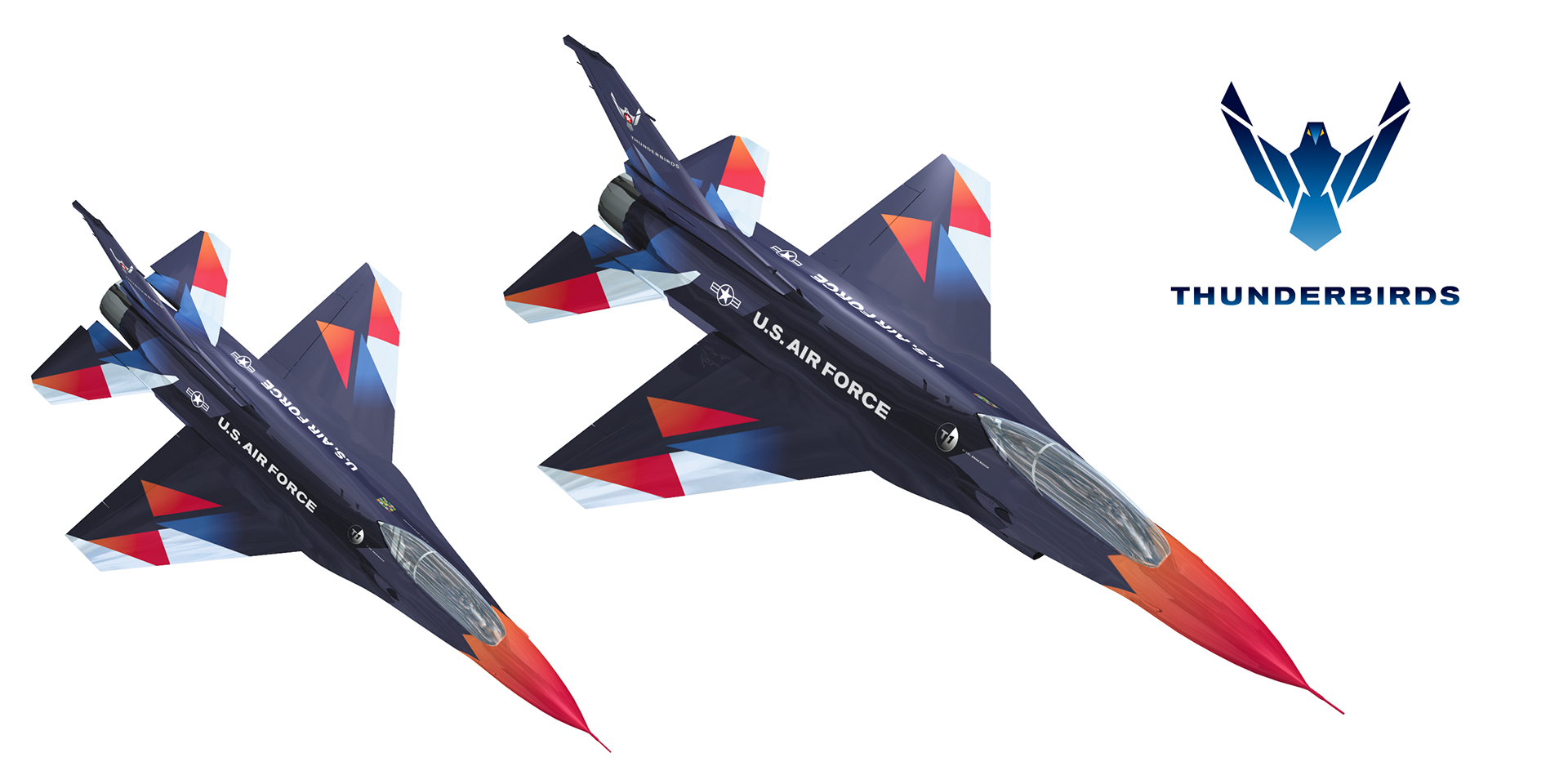
To increase the connection between this demonstration squadron and the larger force, the US Air Force Thunderbirds’ logo was redesigned to echo the US Air Force logo, while using a dark color for the Thunderbirds livery made the aircraft look larger in the sky, giving viewers the impression of tighter, more accurate formations.