![](https://pro2-bar-s3-cdn-cf3.myportfolio.com/0662f233-a5fe-4adf-b242-caa5bc4eb146/4f5a05eb-3913-4172-bfb8-9d23cdb603b6_rw_1920.png?h=9fae29be1b52c9eb9744230b9d31e2a7)
![](https://pro2-bar-s3-cdn-cf.myportfolio.com/0662f233-a5fe-4adf-b242-caa5bc4eb146/19d2bca3-66a5-4808-b409-4f277640f0d7_rw_1920.png?h=14c5bcc00f9440e5a04ab539d1985b4d)
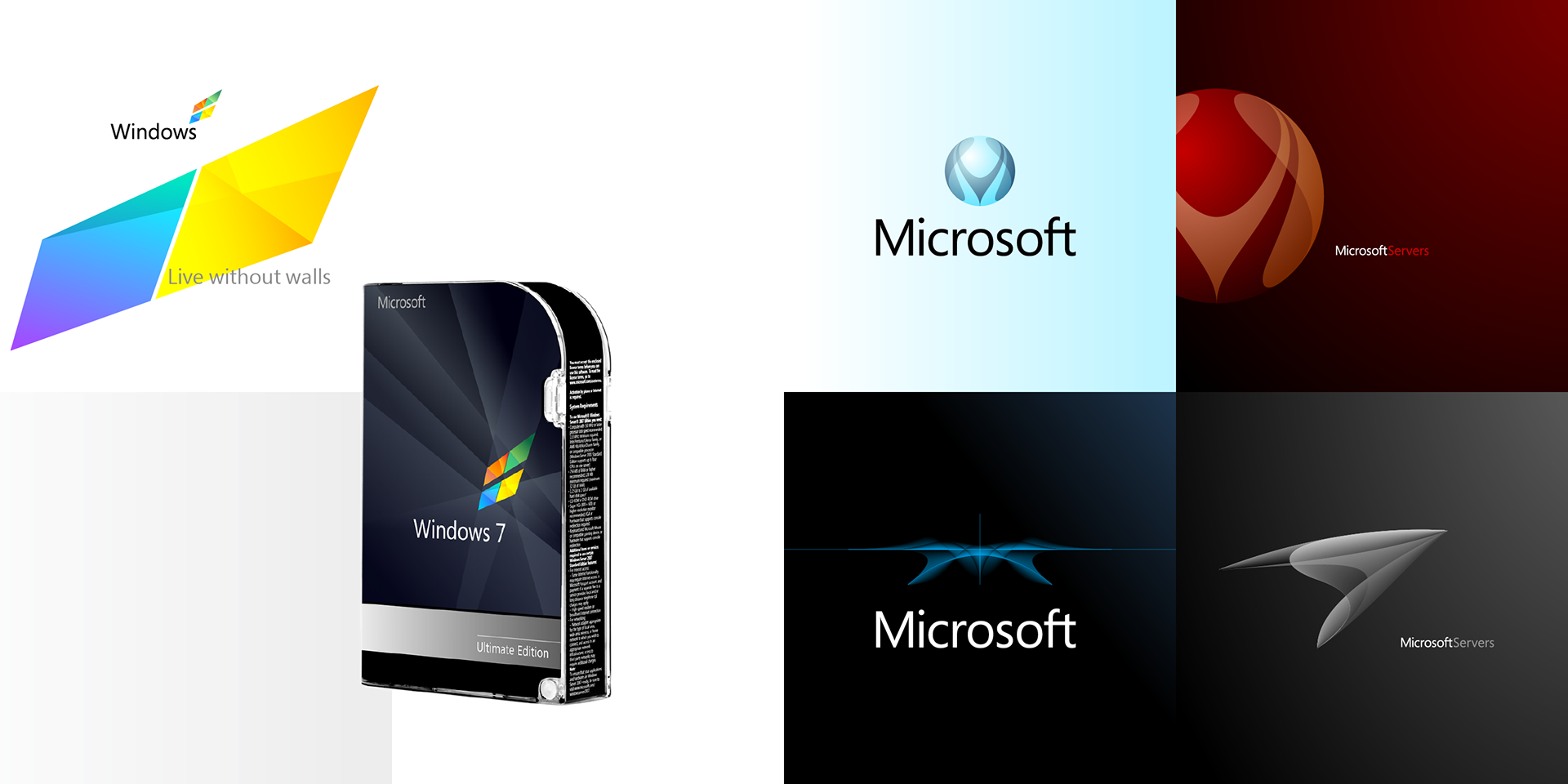
The Windows logo was redesigned to demonstrate how Microsoft's individual products and services could align with the proposed prism logo. Other options proposed were a global icon to express the company's reach, an ‘M’ to represent the connections that it enables and, and an abstract wing to convey the freedom its products provide.