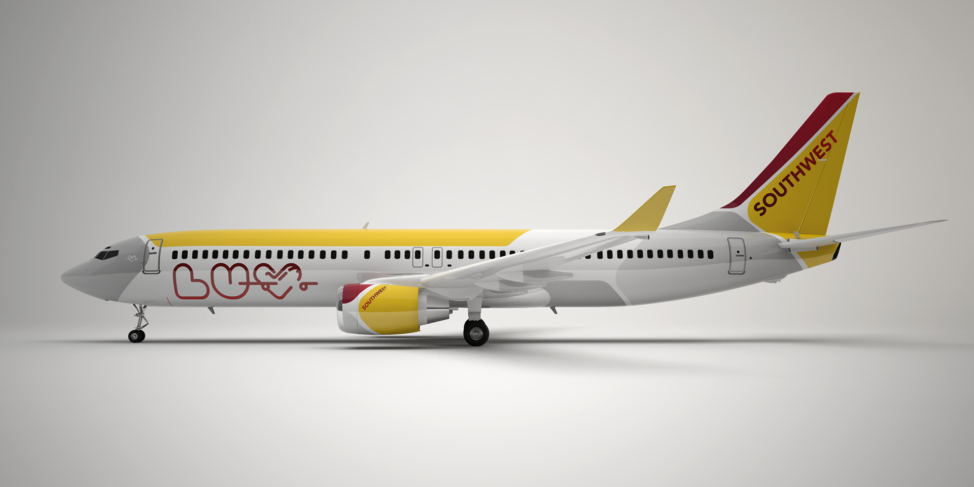
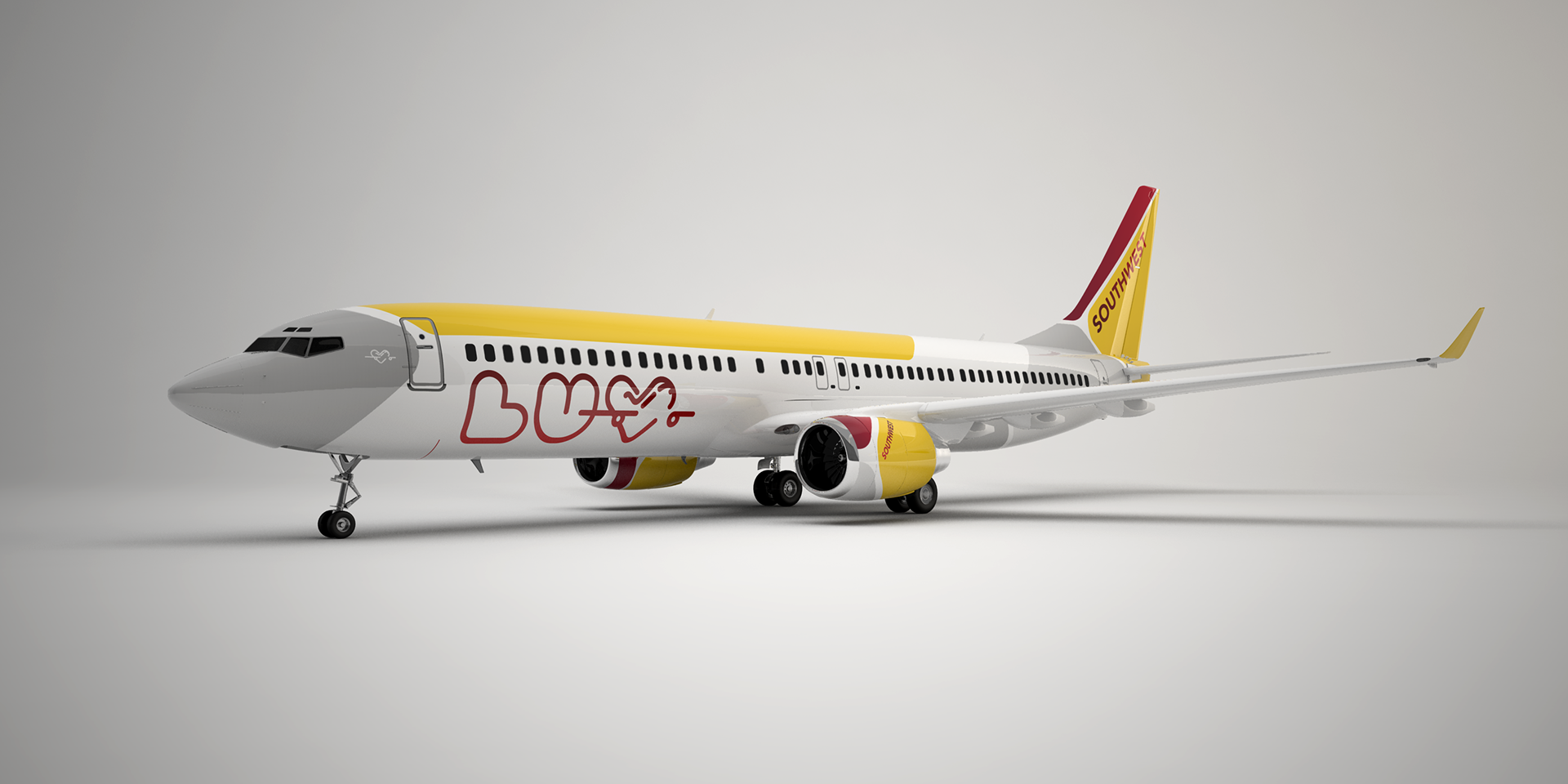
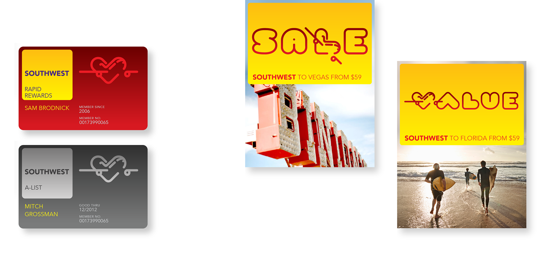
Consolidating both current Southwest logos, the ‘Heart with Wings’ and ‘Take-off’would increase consistency in Southwest’s communications. The shape of the mark allowed it to be used as a playful letter-form in headlines, reflecting Southwest’s cheery approach to connecting with its customers.
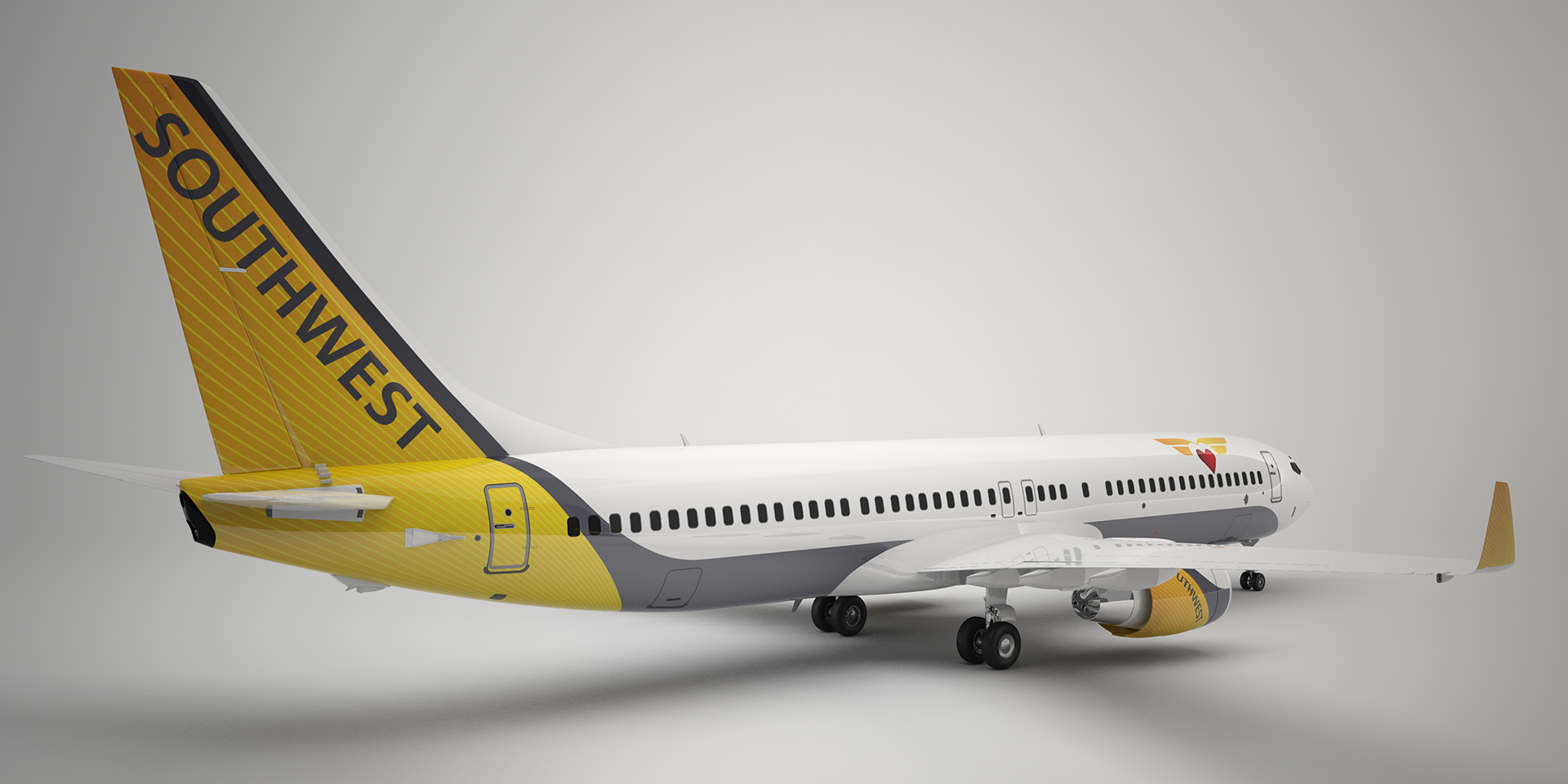
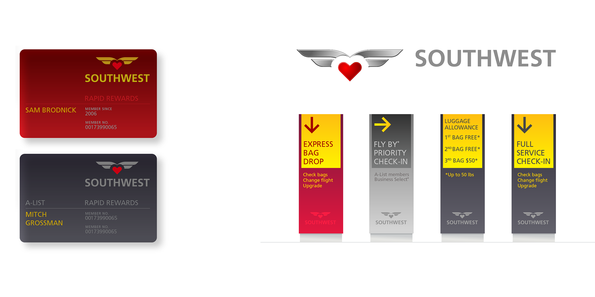
Despite having a unique symbol in the ‘Heart with Wings’ logo, Southwest Airlines was using the less distinctive ‘Take-off’ logo in the majority of customer touch points. Simplifying the Heart with Wings symbol would increase its versatility, allowing the airline to utilize one symbol in all forms of communication.